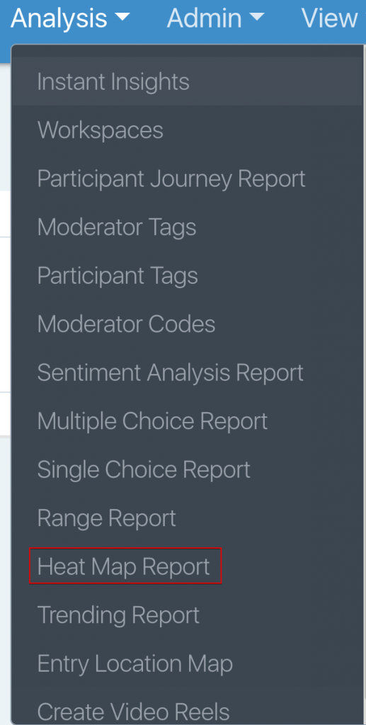
The Heat Map Report can be accessed through the Analysis dropdown within the top navigation.
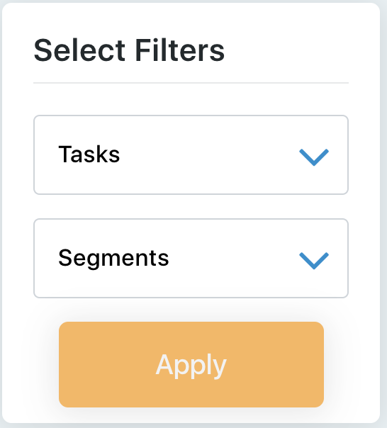
The heat map report displays participant responses from one heat map task at a time. You can switch between single-choice tasks using the ‘Tasks’ filter drop-down menu on the left-hand side of the page. You can use this filter in combination with the ‘Segments’ filter. You will only see the ‘Segments’ filter if you have applied segments to participants.
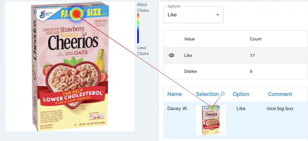
In the screenshot below, you will see the question text up top and all the areas that were selected on the box of Cheerios.
Options:
The default option is “All,” which displays all the clicks on the concept. It also lists out below all the areas that each participant clicked, which is a combination of Likes and Dislikes. You can toggle this to show the other answer options.
Value/Count:
This gives you a total of how many clicks each answer option had.
You will then see a list of the clicks by the participant, the option they selected, and the comments they gave.
If you want to plot just that one selection on the concept, click the color on the box for that participant.